
The usual way
- Learn DAX to write a year-over-year measure
- Build a data model before the first chart appears
- Install a desktop app and sort out licences to share a report
Power BI-style dashboards
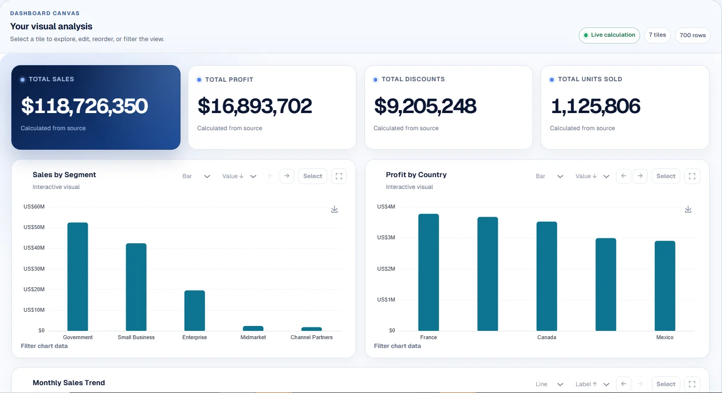
Get the calculations people open Power BI for: comparisons with last period and last year, running totals, percentage rates, rankings and slicers. Describe them in plain English and they are calculated from every row of your spreadsheet, with the dashboard ready in under two minutes. No DAX to write and nothing to install.
What changes
 Photo by Apex Virtual Education on Unsplash
No setup project
No data model to design, no measures to debug, no licence request to wait on. Upload the export, say what you need in plain English, and share a link to a dashboard whose every figure traces back to the spreadsheet.
What you get
Previous period, same period last year and running totals, by day, week, month, quarter or year.
Percentages such as on-time delivery or conversion calculated as a true ratio within each group, the way DIVIDE works in Power BI.
Bar, line, area, pie, scatter, table, waterfall and heatmap, with multi-select slicers on any column.
Define field names and synonyms once, so "turnover" always means your Revenue column.
How to do it
No formulas, no templates to set up. Describe what you need the way you would to a colleague.
Add an Excel or CSV file, including multi-sheet workbooks, or connect a Google Sheet.
Name the measure, the time grain and the comparison you want.
Try typingRevenue by month compared with the same month last year, with a running total.
Switch chart types, add slicers, sort and rank. Every change is recalculated from the rows.
Publish a read-only link, build a board report from it, or save it as a Loop on Pro and rebuild it on next month's file.
Worked example
The subscription metrics sample holds monthly revenue, new and cancelled customers and churn by plan, region and segment. Open it and ask for revenue against the previous period with a running total.
No account, no card, no API key.
Questions
For small teams whose data lives in spreadsheets, yes. You get calculated KPIs, time comparisons, rates, slicers and written reports without a data model. It does not replace Power BI's database connectors, DAX modelling or enterprise governance.
No. Describe the calculation in plain English and it is calculated from every row of your file.
Yes. Any chart over dates can compare with the previous period or the same period last year, and can show a running total.
No. It works from CSV and Excel files and connected Google Sheets. If your Power BI report is built on a spreadsheet, upload that spreadsheet.
Every figure is calculated from the rows in your file, the same way every time, so totals reconcile with your spreadsheet.
Bring the file behind your next recurring task and see a real result in the next few minutes.
Build one from a sample No account, no card, no API key.